Table of Contents (click to expand)
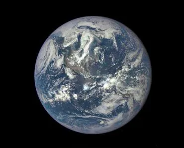
Maps are two dimensional while the Earth is three dimensional, so all maps are innately inaccurate. The Mercator map, which is the most commonly used map in the world, distorts the relative sizes of countries near the poles, making them appear much larger than they actually are. This map also aggrandizes the northern hemisphere, making it appear larger than the southern hemisphere. There are other ways to represent the world that are more accurate, but the Mercator map is still used because it is convenient and familiar.
Yes, you may find this hard to believe, but all of our maps are wrong. No, Google Maps is not an exception to this rule. Maps have and will always be wrong. It’s just a part of human nature – or at least perception.
The thing is, maps are two-dimensional, while the Earth is three-dimensional. Our planet is an imperfect sphere, so flattening it out into a rectangular shape is impossible. What… you don’t believe me? Why don’t you see for yourself… Try pounding a completely intact orange peel into a flat rectangle.
Now, perhaps you understand. All maps are a lie, but they all lie about different parameters. Thus, the things that are chosen to be distorted in a map provides us with clear insight into human behavior.
Recommended Video for you:
The Mercator Map
The map most commonly used in the world is the Mercator map. This is the map that we see in classrooms all over the world. This is also the map that formulates our basic ideas of what our planet looks like. In fact, even Google Maps uses the Mercator map.
To be completely honest, it IS a convenient map. The latitudes and longitudes are straight lines that intersect perpendicularly, the rectangular shape is nice and compact for printing, and the shapes of the countries are well defined. However, the one thing this map does not get right is the relative sizes of the countries. The countries near the poles are portrayed as being much larger than they really are.
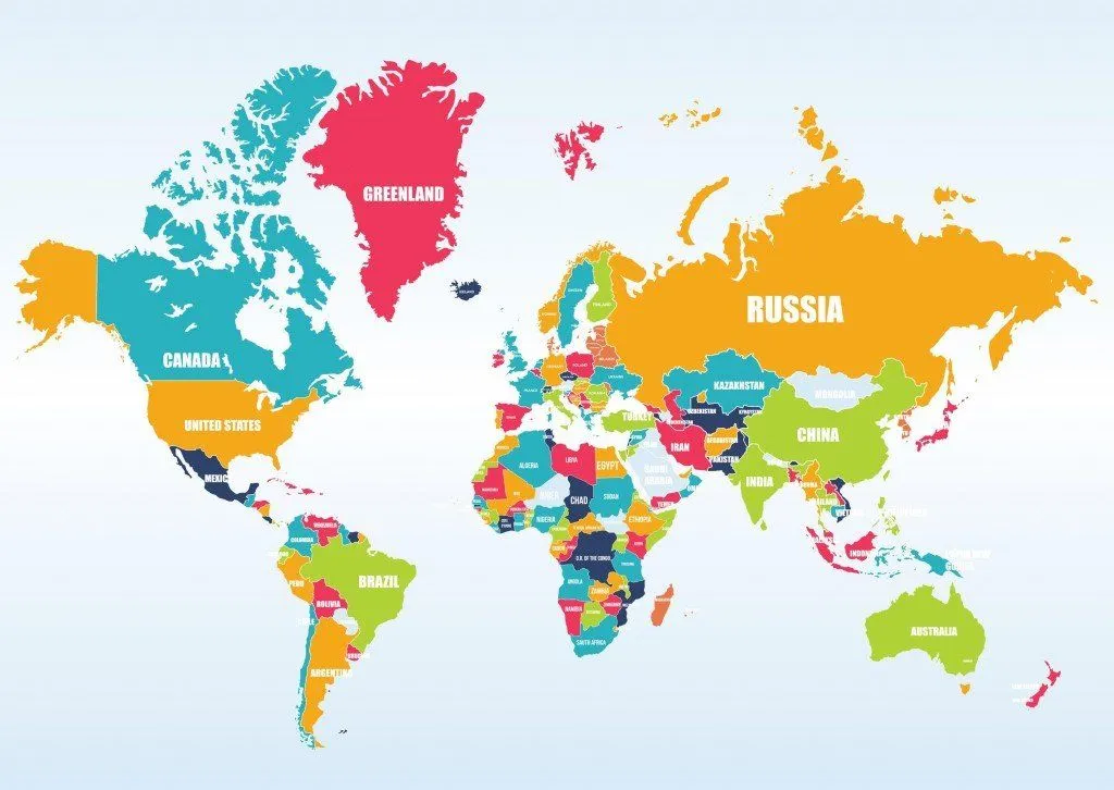
Take a good look at the map. Go on… Really look at it. North America seems larger than Africa, Scandinavian countries are larger than India, and Alaska looks bigger than Brazil. Greenland appears to be a large sparse island big enough to rival Africa.
This is the map that you’ve grown up with, so surely it isn’t that much of a lie, right? How bad could the disparity really be?
Answer: Extremely Bad.
Please allow me to show you the real world.
Why Are All Maps Wrong?
There are multiple issues and we will look at them one by one.
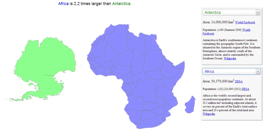
Is Africa Bigger Than North America?
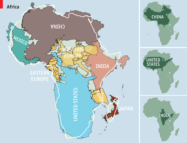
Let’s first address the elephant in the room. Africa. In reality, Africa is actually HUGE! It is 1.23 times the size of North America, despite the fact that in the Mercator Map, North America looks larger. You can fit the USA, India, Europe, and China into Africa and still have space for Liberia and Japan.
The Greenland Problem
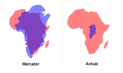
Then, there is the Greenland issue. Greenland’s ratio is WAY off. On the Mercator map, it looks as big as Africa, but in truth, it is only 1/14th of Africa’s size! Greenland is nowhere near the massiveness of Africa. It is tinier than the Democratic Republic of Congo – just a single one of Africa’s 54 nations. Greenland is so misrepresented that cartographers tend to call the size distortion of the Mercator map the ‘Greenland Problem’.
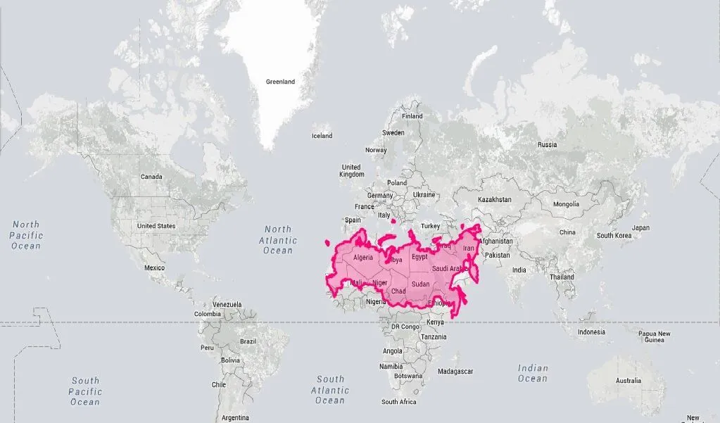
Then there are some more problems. Such as this one. Everything seems puny in comparison to Africa. For example, scroll up and compare Russia with Africa. It looks larger, right? Nope. Look again.
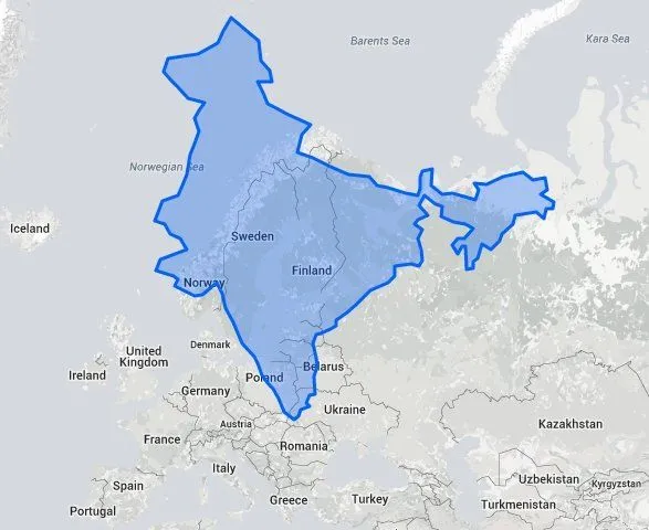
Even India appears to be much smaller than it actually is. In the real world, it happens to be 3 times larger than the Scandinavian countries, which is why it can house the second-largest population in the world!
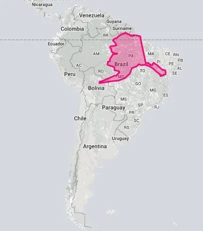
Alaska is also puny when compared to Brazil – it is 5 times smaller than the South American giant, and even Mexico is larger than Alaska in terms of area.
Antarctica is usually shown as a huge landmass at the bottom of the map, but how big is it really?
To understand our map even better, you should try using James Talmage and Damon Maneice’s interactive map project called The True Size. It lets you visualize how large countries really are.
MAPS Vs REALITY
Because the distortion of Antarctica is so severe, cartographers tend to just crop the continent off. However, that leads to another new problem. The northern hemisphere, in this case, appears larger than its southern counterpart.
The aggrandizing of the northern areas is where the real issue lies. The map that we use today was made in the era of colonial expansion. Western Imperialism reigned and European nations scrambled to force as many countries into submission as possible. During this mad rush to conquer the wealth of the world, political correctness was the last thing on their mind.
Peters Projection Map
The truth is that the map could have been created with any number of different distortions. Take the Galls-Peters map projection, for example (shown below). This map projection chooses to distort the distances rather than the relative sizes of the countries.
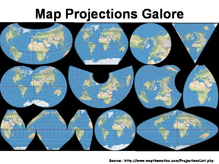
No, Maps Don’t Need To Be Rectangular In Shape!
A map doesn’t even necessarily need to be rectangular in shape. To achieve correct shape, size, AND distance, there are a number of ways to represent a map in a much better way, so we have an accurate image of reality.
Also, why does the North have to be north anyway? Why does Europe have to be at the top of the map? Space is infinite, which means that there is no “Up” or “Down” in the universe.
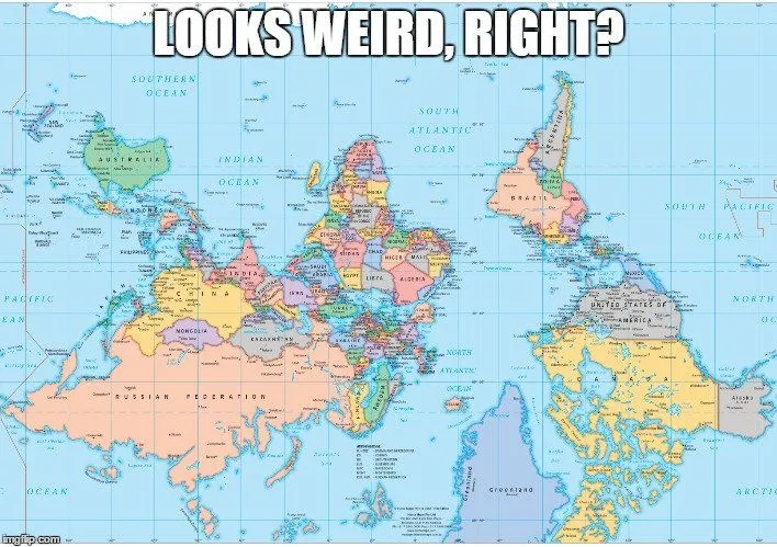
Furthermore, why does West have to be west? North America is closer to Asia than it is to Europe, so why is the International Date Line between them? Why does the Prime Meridian, the central line of longitude, pass through Western Europe? There can only be one Equator, considering the Earth’s axis, but the Prime Meridian is a completely arbitrary line that could have been drawn anywhere.
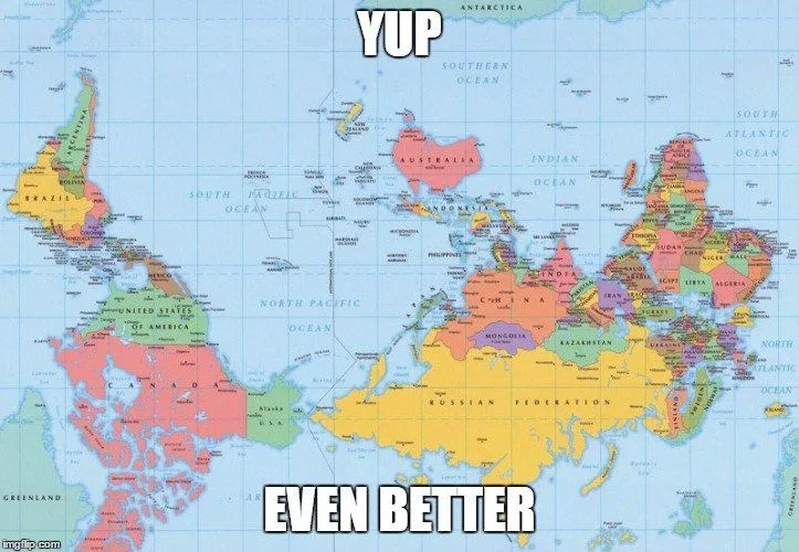
However, of all the possible map projections, 16th century Europeans felt the most comfortable with choosing one that inflated their countries to match the size of their egos. Central position, top of the world, and enlarged countries – how could the Europeans resist the temptation? As we hear so often, the victors write the history books, and apparently, they also draw the maps!
Don’t get me wrong. I don’t blame those European rulers and cartographers. In 1623, a Chinese terrestrial globe called the Hinese Globe was made for the Chinese Emperor. The creators exaggerated the size of China and placed it in the middle of a world that otherwise consisted of small offshore islands.
The point that I’m trying to make is that all of our maps are doomed to be wrong. There is no single perspective from which to view the Earth, and no matter what we do, our social and political biases will shine through. An alien sketching our planet might end up drawing something completely different from what we’re using today.
I’m not saying that we should all change our maps overnight, as that would be pointless after all this time. However, what we can do is remember how arbitrary maps truly are. Everyone should know that they don’t reflect the truth, but rather the history of how our accepted “truths” came to be.
What must be understood is this…Our world is much more complex and beautiful than a simple two-dimensional projection of it. Go out and see for yourself!